The Patriots vs Texans matchup has quickly turned into one of the most exciting games to watch on the NFL calendar. Whether you are a fan from the cold streets of Foxborough or the sunny humid air of Houston, this game always delivers. In their latest meeting during Week 6 of the 2024 season, we saw a changing of the guard. The Texans came into Gillette Stadium and made a huge statement with a 41–21 victory.
This game wasn’t just about the score; it was about the future. We saw rookie quarterbacks trying to find their footing and veteran stars making plays that left us breathless. Seeing the patriots vs texans rivalry grow like this is a treat for any football fan. It’s no longer just a lopsided history; it’s a modern battle for AFC dominance. Let’s dive into the nitty-gritty of how these two teams stack up against each other!
A Detailed Look at the 2024 Week 6 Clash
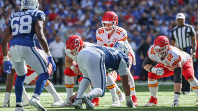
When the patriots vs texans game kicked off in October 2024, the energy was electric. It was a special day because it marked the first career start for New England’s rookie quarterback, Drake Maye. While the rookie showed a lot of heart, the Texans’ defense was just too much. Led by Will Anderson Jr., who had three sacks, Houston kept the pressure on all afternoon.
On the offensive side, C.J. Stroud proved why he is one of the best young leaders in the league. He threw three touchdown passes, spreading the ball to stars like Stefon Diggs and Tank Dell. The Texans also found a groove on the ground. Joe Mixon returned from injury to rush for over 100 yards. This balanced attack made it very hard for the Patriots to keep up, resulting in a big road win for Houston.
Game Summary Table: Patriots vs Texans (Week 6, 2024)
The Historical Rivalry: Who Owns the Series?
If you look back at the history of patriots vs texans, the Patriots held a huge lead for a long time. For years, New England was the “big brother” of the AFC, often winning games before they even started. However, the tide is turning. Before the 2024 win, the Texans had never won a game at Gillette Stadium. Breaking that “curse” was a huge milestone for the franchise.
Historically, the Patriots still lead the all-time series, but Houston is catching up fast. Recent years have shown that the Texans are no longer intimidated by the banners hanging in Foxborough. With new coaching and elite young talent, the patriots vs texans matchups are becoming much more competitive. Fans used to expect a blowout, but now they expect a dogfight.
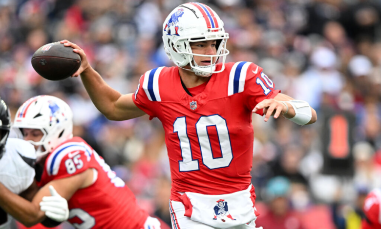
Drake Maye’s Big Debut Against Houston
Even though the Patriots lost, fans left the stadium feeling hopeful. Why? Because of Drake Maye. In the patriots vs texans game, Maye threw for three touchdowns. That is a big deal for a rookie’s first start! He showed off a strong arm and the ability to run when things got messy.
Of course, there were mistakes. He had two interceptions and lost a fumble. But against a defense as good as Houston’s, those are growing pains. Comparing his performance to the veteran Houston squad showed that while he has a long way to go, the Patriots might have finally found their franchise player. The patriots vs texans game will always be remembered as the day the Maye era officially began.
C.J. Stroud: The Calm in the Storm
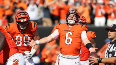
On the other side of the field, C.J. Stroud played like a seasoned pro. During the patriots vs texans matchup, he never looked rattled. Even when the New England crowd got loud, he stayed calm. He made smart choices and put the ball exactly where his receivers needed it.
What makes Stroud special is how he uses his teammates. He doesn’t just look for one star; he finds the open man. In the patriots vs texans contest, he utilized the tight end Dalton Schultz and the speedy Tank Dell to keep the chains moving. This maturity is why Houston is considered a Super Bowl contender while the Patriots are still rebuilding.
Key Matchups That Decided the Game
Football is a game of “one-on-one” battles, and the patriots vs texans game had some greats. One of the most important was Will Anderson Jr. versus the Patriots’ offensive line. Anderson was a nightmare all day, living in the backfield. When a quarterback is under that much pressure, it’s hard to stay focused.
Another key battle was the Texans’ secondary against the Patriots’ wide receivers. Stefon Diggs, now a Texan, brought a veteran presence that the Patriots’ young cornerbacks struggled to handle. These individual wins added up, allowing Houston to pull away in the second half. The patriots vs texans score reflected who won the most of these small battles.
Coaching Strategies: Ryans vs Mayo
This game was also a chess match between two young coaches. DeMeco Ryans has built a “swarm” defense in Houston that is fast and physical. In the patriots vs texans game, you could see his fingerprints everywhere. His team played with a high level of discipline and energy.
Jerod Mayo, the Patriots’ head coach, is trying to build a similar culture in New England. While the results haven’t been as consistent yet, you can see the effort. Mayo’s decision to start Maye in the patriots vs texans game was a bold move designed to spark the offense. It didn’t result in a win this time, but it set the stage for the team’s development.
The Impact of Joe Mixon’s Return
Having a strong run game is like having a security blanket for a quarterback. When Joe Mixon suited up for the patriots vs texans game, everything changed for Houston. His ability to gain tough yards on first and second down kept the Patriots’ defense honest.
Because Mixon was so effective, the Patriots had to bring more players close to the line of scrimmage. This opened up the passing lanes for Stroud. Without Mixon, the patriots vs texans game might have been much closer. He finished with a 59-yard run that essentially iced the game, showing why he was such a big off-season pickup for Houston.
Looking Ahead: Future Patriots vs Texans Matchups
What does the future hold for patriots vs texans? We might be looking at the next great AFC rivalry. Both teams have young, talented quarterbacks who could be playing against each other for the next ten years. This isn’t just a random game anymore; it’s a preview of the playoffs to come.
As the Patriots continue to add talent around Drake Maye, these games will only get tighter. The patriots vs texans showdown is becoming a “must-watch” for anyone who loves high-level quarterback play and hard-hitting defense. We can’t wait to see what happens the next time these two teams meet on the turf.
Defensive Highlights: The “Swarm” in Action
Houston’s defense is nicknamed the “Swarm” for a reason. They fly to the ball! In the patriots vs texans game, they forced multiple turnovers that shifted the momentum. It wasn’t just about the sacks; it was about the tipped passes and the constant pressure that forced Maye into quick decisions.
For New England, the defense had some bright spots but eventually wore down. Playing against an offense as explosive as Houston’s requires perfection. In the patriots vs texans battle, a few missed tackles turned short gains into long touchdowns. Improving this consistency will be the top priority for Coach Mayo moving forward.
Summary and Final Thoughts
The patriots vs texans game in 2024 was a turning point for both teams. For Houston, it was a chance to prove they can win anywhere, against anyone. For New England, it was a glimpse into a future led by a promising young quarterback. While the score was 41–21, the game felt like the start of something much bigger.
Whether you’re tracking stats for fantasy football or just cheering for your favorite team, the patriots vs texans rivalry is one to watch. Both franchises are heading in exciting directions, and we are just lucky enough to enjoy the ride!
FAQs About Patriots vs Texans
- Who won the last Patriots vs Texans game? The Houston Texans won the most recent matchup 41–21 on October 13, 2024.
- How many times have the Patriots and Texans played? As of the end of the 2024 season, the teams have met 14 times, with the Patriots holding the overall lead in the series.
- Who were the starting quarterbacks in the 2024 Week 6 game? Drake Maye started for the New England Patriots, and C.J. Stroud started for the Houston Texans.
- Has Houston ever won at New England? Yes! The Texans’ 41–21 victory in 2024 was their first-ever win at Gillette Stadium.
- What was the biggest play in the 2024 game? Many fans point to Joe Mixon’s 59-yard run or Drake Maye’s 40-yard touchdown pass to Kayshon Boutte.
- Where can I watch the next Patriots vs Texans game? Future games are typically broadcast on CBS, FOX, or Prime Video, depending on the NFL schedule.
Conclusion
The patriots vs texans matchup is a perfect example of why we love the NFL. It features a blend of rich history and a bright, shining future. While the Texans took the “W” this time, the Patriots showed they have the pieces to compete very soon. What was your favorite moment from the game? Was it the rookie’s first TD or the Texans’ dominant defense? Let us know your thoughts and stay tuned for more NFL updates!